Light Makes the Case: Office and Corridor Lighting at Zuckerman Spaeder
At Zuckerman Spaeder’s Washington, DC, office, light makes a compelling case for atmosphere. Thin illuminated lines travel across wood ceilings, descend elevator lobby walls, and reappear along the café stair, elevating the space with a subtle but memorable glow that doesn’t rely on decorative fixtures or traditional signage.
A brief for atmosphere
For Sarah Richter, Principal and Lead Designer of Sarah Richter Design (SRD), the project called for a lighting approach that could support the practical demands of a law firm while giving key common areas a more distinctive identity.
“They’re going to host, and they’re going to do a lot of things both virtually and in person,” Richter explained. “When it came to the lighting design, it had to support both of those modes.”
That balance shaped the broader lighting strategy. Private offices and conference rooms required consistent illumination, while public-facing areas offered room for more expressive architectural lighting. Throughout the workplace, recessed linear LED lighting helped create continuous, functional illumination. But in the elevator lobbies and café stair, light became a defining design element.
A signature without signage
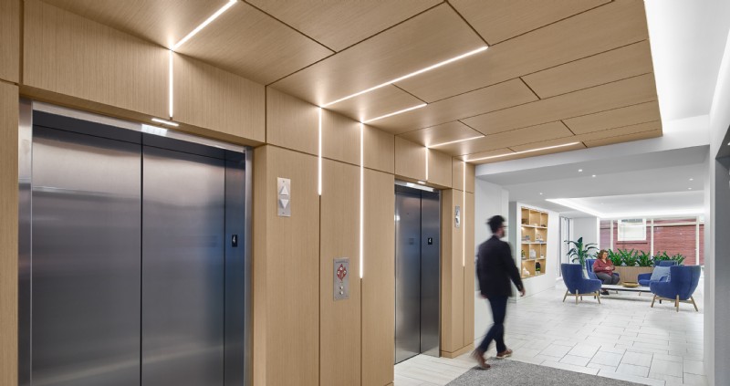
 The concept began with Zuckerman Spaeder’s abbreviated name, ZS. Rather than translating the brand into conventional signage, SRD used linear light to suggest the movement and geometry of the letters. In the elevator lobby, the corridor LED lighting runs through the wood ceiling and down the walls, creating a sense of arrival and pause around the elevator doors.
“They wanted to make sure that when you came up to the elevator lobby, you were immediately hit with a branding moment without seeing, ‘Here’s the signage,’” Richter said.
Corridor lighting that takes a stand
The wood detailing made precision essential. The architect wanted every reveal between the panels to remain consistent, whether or not it contained light. In the elevator lobbies, QTL’s MICRO 5 was integrated into the wood ceiling and wall reveals, allowing the illuminated lines to follow the same narrow rhythm as the surrounding millwork. Its slim profile helped the lighting feel built into the architecture rather than added on, preserving the unbroken look of the corridor.
Behind the scenes, QTL's QZ LED power supply mounts remotely, keeping drivers out of the fixture footprint and the illuminated wood details clean and uninterrupted. That separation between power source and light source is what allows intricate millwork and specialty ceiling conditions to read without visible hardware breaking the effect. For Richter, it was a key part of making those details work.
“You press the button, you’re waiting for the elevator, and you feel like you’re almost in this room with the lighting effect,” Richter said. “Whether you’re coming or going, it embodies the experience of getting onto the elevator and starting that vertical motion.”
A closing argument for connection
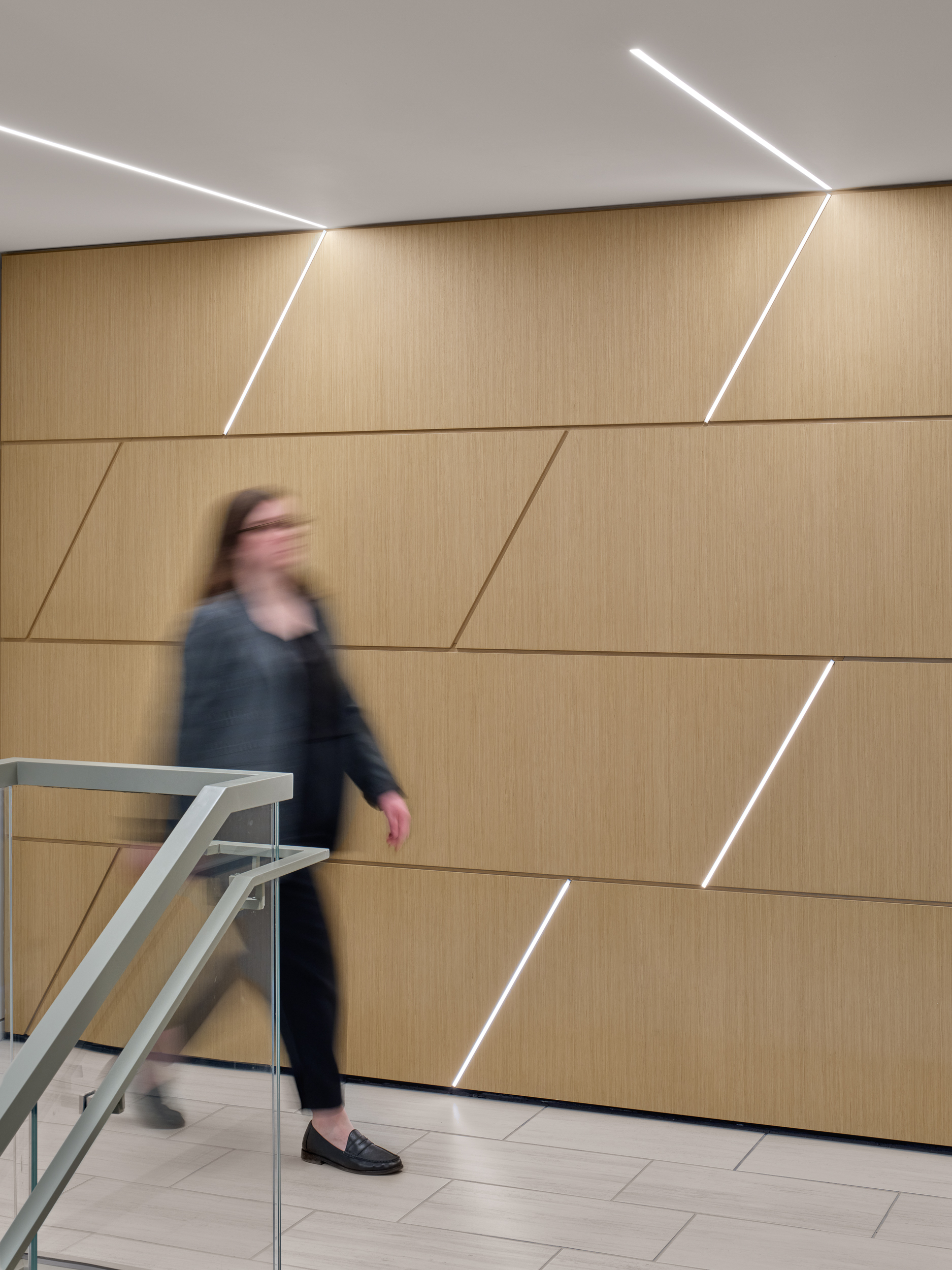
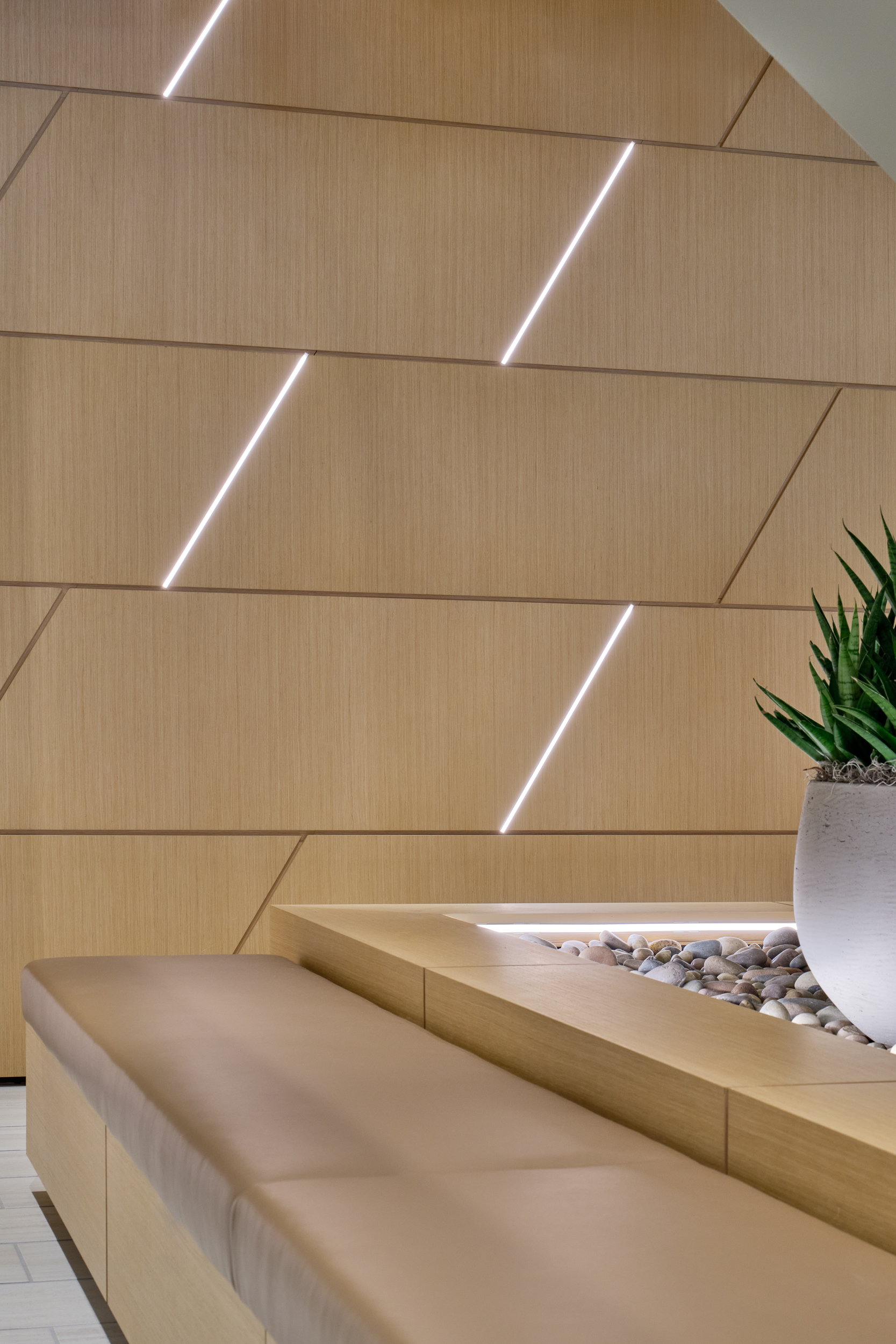 At the café stair, the lighting shifts from vertical order to angled movement. Linear ceiling lights lead the eye toward QTL-illuminated lines set within the wood feature wall, creating a dynamic focal point that connects two floors and draws people toward a more social part of the office.
“If all the lighting is always coming from direct illumination above, it feels flat,” Richter noted. “Having that feature wall connecting those two floors and adding vertical interest created a moment where people could hang out.”
The team considered a simpler recessed strip light approach, but the visibility of the installation called for a cleaner, more finished solution with even diffusion and no visible diodes.
“We wanted there to be an appreciable amount of light, but not at the chance of seeing diodes,” Richter said.
For Richter, QTL offered the level of refinement the detail required. “I know the quality of QTL is more elevated,” she said. “It is unlike many others on the market because of how seamless it looks and such a tight profile to get the punch that we really needed to make that effect really pop with the wood.”
The result is commercial office lighting design where LEDs do more than illuminate. They sharpen the architecture, warm the wood, guide movement, and give Zuckerman Spaeder’s shared spaces a sense of energy and identity.